For e-commerce, web design is existentially useful if it’s done right. An intuitive ecommerce website design drives leads, conversions, sales, profits, and customer allegiance. A bad one, on the other hand, makes prospects to bounce off your website. Imagine how frustrating it is for a user to put up with a shabby, hard to navigate and unresponsive website. Modern day buyers are discerning, preferring well-designed sites that balance aesthetics and functionality for a pleasurable UX. When website fails are not an option, choosing the right platform is crucial.
Meet Shopify, the world’s leading e-commerce platform, trusted by 1,000,000 plus businesses, globally. Whether you sell offline, online or on social media, the platform makes sense. It’s easy and economical to set up and use. No tech expertise required on your part. Just set it up, do the branding part, add product information, and start selling right away. Put to the past the server and software maintenance and upgrade hassles, as the platform has you covered. An array of SEO and marketing tools, and 24/7 technical support also come by default with Shopify.
Shopify addresses your security concerns, frontally. Your PCI compliance is well taken care of to let you handle credit card payments. Feel free to enable SSL certificates to encrypt all sensitive customer information, and keep it away from intrusion. With over 160 fully customised themes to choose from, expect absolute control over the look and feel of your website. The themes are mobile-friendly, allowing you to tap into the increasing mobile visits for business gains. There’s even a free built-in m-commerce shopping cart, allowing buyers to place orders on the go.
Theme it Right
We get it; you’re totally excited to put together a website with Shopify website design —but not so fast. First, choose a Shopify theme suiting your bottom line. The theme decides how visually pleasing, user-friendly, functional, and unique your website would pan out, eventually. Venture, Debut, and other basic themes work well for the cash cramped start-ups. The caveat is their limited functionality, requiring you to install some additional plugins and tweak codes. Let not the diversity of theme options overwhelm you – here’re a few of your best options.
1. WOKIEE:
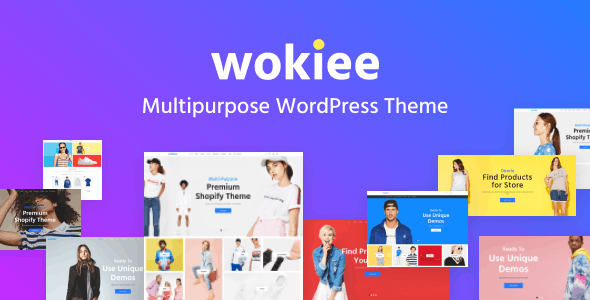
If a versatile Shopify theme is a priority, WOKIEE would exceed your expectations. Whether it’s a single or multi-product shop, the theme has you covered. Let the 16 new, unique skins and a barrage of blocks help you create a website layout that’s truly one-of-a-kind, sophisticated yet simple, highly responsive, and easy to navigate. All visual elements, from menus and catalogues to blogs are easily customisable. Also, expect mega menus for a fine UX, a customisable CMS, Instagram feed integration, template integration, product comparison feature, and more.
2. Basel:
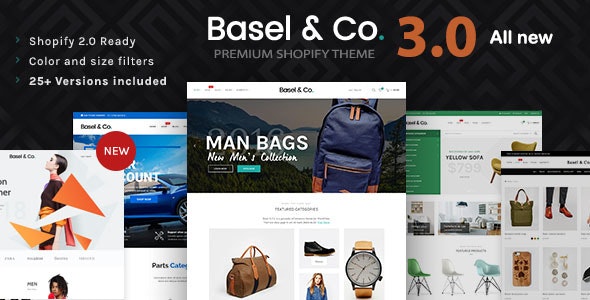
Looking for an ecommerce website design with classy storefront and powerful features? Don’t go any further than Basel, a minimalist AJAX theme suitable for businesses across industries. Fashion, flowers, food, electronics, furniture, and accessories, you name it. Count on a page builder with Drag & Drop capabilities, along with multiple theme settings, and stunning sliders for quick and easy setup. Expect a cross-device compatible site that also works with Nitro apps.
3. SHELLA:
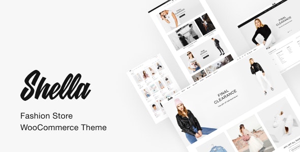
Feast your eyes on SHELLA, perhaps the ultimate theme in Shopify’s arsenal. Performance is its defining trait, ensuring low loading times, speedy navigation, and responsiveness for a surreal UX. It’s best suited for fashion, accessories and the likes. The theme packs a punch with an in-built True Filter, allowing your customers to narrow down searches based on title, price, and other parameters. AJAX filtering, banner builder and new, updated skins are also guaranteed.
4. FASTOR:
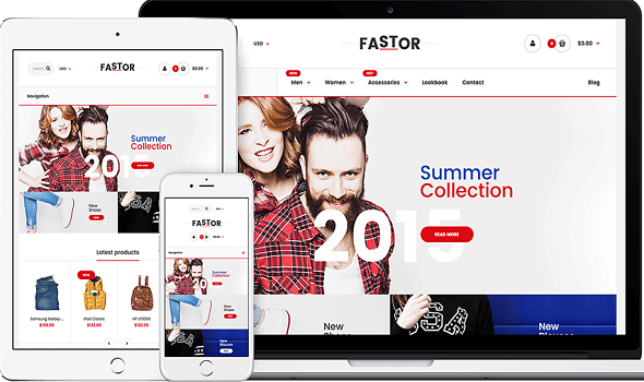
Another proven performer, FASTOR delights you with modish, uncluttered interface, and some powerful features. Shopify has updated the theme multiple times to suit changing e-commerce dynamics. The latest version, FASTOR v4, is geared towards delivering great speeds, less clutter, and supporting a potpourri of Shopify features. With 82 skins to choose from, you are spoilt for choices. Video walkthroughs and tutorials have been added to elevate the overall UX.
5. Gecko:
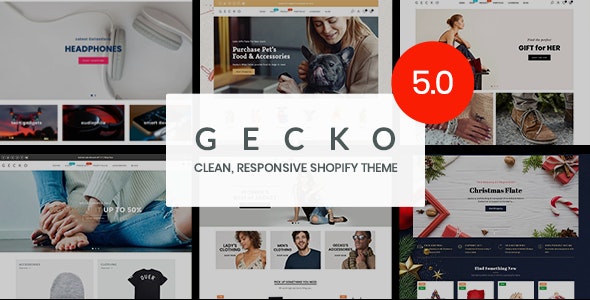
Give your new e-commerce website the Gecko advantage. What sets it apart is a full continuum of subtly varying homepages and layouts that contribute to an inviting, unique, user-friendly website. Features like robust theme panel, product bundles, and a multitude of short-codes are there to help you make the most of your Shopify’s selling features. The latest update allows for Instagram feed integration, and access to RYVIU – a highly rated product review web portal.
Inspirational design ideas:
Now that themes are out of the way, it’s time for some inspiration. Here’re the 10 best Shopify website design ideas handpicked by our experts to help you create something exceptional.
1. Fred Jourdain
If selling art online is a challenge, Fred Jourdain takes it head-on. The Shopify website design welcomes you with a rotating homepage banner showcasing the artist’s best works – an interesting way to make a subtle sales pitch. Just dig deeper, you’ll find a repository of books, projects, interviews, and more. The sellable keeps you engaged, and so would the website’s navigability, cross-device compatibility, and the deeply entrenched trust-factor.
2. Pura Vida Bracelets
Are you a startup keen on building trust? If yes, then take a leaf out of Pura Vida Bracelets’ book. Besides an attractive header, the home page is populated with reviews from BuzzFeed, HuffPost, and the likes to foster trust. Photographed with clarity and detail, the products are aesthetically presented. The CTA is powerful but not pushy. Free shipping is highlighted right at the top while at the bottom, there’s a chat bubble to ensure hands-on buying assistance.
3. MVMT
MVMT’s bottom line is to make style affordable, and its website reflects it well. Sophisticated and sleek, the website quickly takes you through watches, eyewear, and jewelry. Just click the ‘Trending Now’ section to explore what’s new and trendy from MVMT. The collaborations with some renowned designers are aptly highlighted to draw your attention right at the outset. Being responsive, the website works seamlessly across smartphones, tabs, and PCs.
4. Allbirds
Wearing your passion on the sleeves is an effective way to entice like-minded buyers. That’s exactly what Allbirds does with such efficacy. From photographs to product description, every element of the website is in line with the apparel store’s passion for sustainability. The favorite picks are cleverly highlighted and indexed to keep buyers clicking through. The CTA is subtle yet effective, and the photographs feature products that align with its target audience.
5. Hardgraft
Hardgraft’s core brand value is “Luxury Lifestyle Accessories with Down to Earth Aesthetics”. The website does remarkable job at underlining it. Feast your eyes on stunningly photographed products while scrolling down the homepage featuring a relatively simple design. As you move into product pages, get ready to be mesmerized by some infographic content showcasing product features. Worldwide shipping is highlighted to keep international buyers interested.
6. Verve Roasters
Verve Roaster blends evocative language and astounding photography to get noticed. Don’t be surprised if phrases like “crafting the future of coffee” entice you into buying. At the middle of the homepage is the “skip the line and order ahead” icon – a compelling CTA. Standard shipping with Shop Now (another CTA) is highlighted in the header. A free shipping offer pops up only to promote click through rates. Also, expect on-the-go shopping, thanks to a responsive interface.
7. Alice + Whittles
Another eco-conscious seller, Alice + Whittles makes it to the list for its sheer visual appeal and the promise of a convenient shopping experience with Shopify website design. The sustainable footwear store incorporates a Chabot for buying assistance – a cool way to promote sales and build trust. The menu widget, ‘Last Chance’ is an interesting feature to speed up the buying process. Think shipping, returns and EMI options, all relevant info is highlighted on the homepage.
8. KITH
A simple e-commerce website can be elegant, and KITH is the right example for that. It greets you with a nicely made video sending across a message on the brand and its ethos. The black and white color scheme paired with magnificent photographs captivates your imagination. The lookbooks run you through some of the trendiest styles there for the taking. The extensive catalogue is diligently indexed into relevant categories for quick and easy searches.
9. Subtle Asian Treats
Subtle Asian Treats’ e-commerce website is the industry standard in the dropshipping niche. With loads of visual appeal, high quality content and user-friendly interface, it’s easy to guess why. Just glide through the kawaii merchandise and plushies and make purchases just like that. Looking for shipping information, specials and customer reviews? That’s easily accessible as well. The trust is harbored with a message from the founder and Instagram feed integration.
10. Modern Urban Jungle
It’s a plant store that also vends home-wares. The design motifs on its ecommerce website design reflect that very well. The color scheme is stunning and so is the photography. The well-structured layout contributes to the UX, ensuring speedy and convenient navigation. Responsiveness also comes by default.
For more information on Shopify store development, Shopify web design, and e-commerce web design, please click here.

