Creating an outstanding professional portfolio website which showcases your work & creativity will boost your business prospects. The diligent industry of Interior design is exotic, exciting and artistic to say the least. For designer, it is vital that they offer a well-designed portfolio website as it can spur your career and work inflow and facilitate interaction between you and your potential client.
Apart from your collection of creative works, your website also needs to be appealing to the visitors. This will give them a bit of hint about your work culture and how you go about the projects and details associated with it. Professional and attractive website can be your online address where people can find about you and the work, you are associated with. Moreover, the better the website, more chances of getting business through it and selling your services frequently.
Interior designing business are flourishing around the world. People looking for some renovation, upgrading their homes or simply designing any property, cafes, restaurants all head for imaginative designers. We have selected 15 websites, the best from the surrounding world of design. So, here are top 15 best website designs for Interior designer companies that has less clutter, mainly showcasing their artistic work which gives an enduring impression–
1. Patchwork
True to their name, patchwork showcases their work in patch images and bigger fonts fits perfectly on the motion given to it. The design of the website is something which will hold the visitor that extra minute to spend looking at the beautifully constructed website.
2. Case 3D

A classy combination of animation and creativity makes this website a perfect example to demonstrate your portfolio. The website has been given an exceptional scrolling navigation menu which comes out pleasing to the visitor. Case 3D’s website can be one of the few innovative websites that you will come across.
3. The Interia
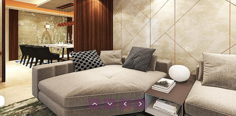
Filled with motion and remarkable design, the interia has so many surprises sated in the website. The visitor will have one of its kind experiences when they will visit the interia’s website. The overall built and given the fact, it has been creatively crafted, makes it feature on this list.
4. Melyssa Robert Interior
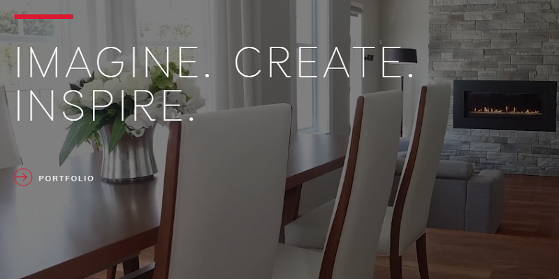
This website will surely win your heart with the kind of motion given when scrolling. Showing their glimpse in boxes and utilizing the spaces and making full use of the wide screen. The Logo ‘MR’ has been given good animation. Menu on the left has superb motion when you click on it, adds elegance to the website’s design.
5. Karim Rashid
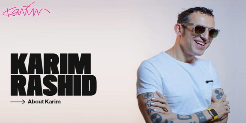
One of the best websites you can draw inspiration from, Karim knows how to market his business and planned his website extensively. Visual hierarchy and good typography appeal to the visitor in this particular website. Karim Rashid’s website is one hell of an example on how you should plan and execute the design while reflecting your work as well.
6. Andrey Sokruta
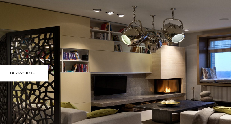
A pinnacle of what website should be, Andrey Sokruta distinctly categorised the projects and showed full page images on the website. Some great visuals and focused designer’s vision come nicely on his website. Many functions on the website keep us engaged which is considered to be the key aspect to turn visitor into client.
7. Hopdeco
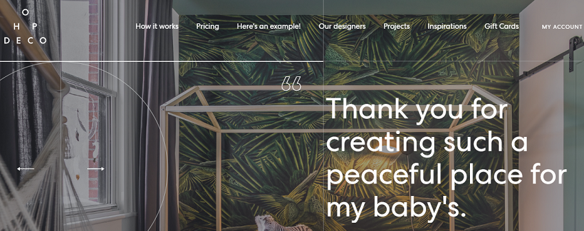
An amazing website, gives surreal feel for the visitor to explore more inside it when scrolling. Includes a lot of their projects from different field showing wide range of various architecture images. As exceptional on the eye, the website is more appealing and attracts the visitor with its charm.
8. WRS Design
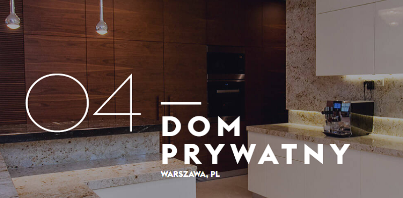
WRS has rolled many great features into the website for their visitors to introspect. Provided some exceptional hover effect with parallax effect for the users to engage them on the website itself. Projects has been beautifully highlighted by amazing photographs. Website is attractive and has the potential to be on our list certainly.
9. Laure Caye
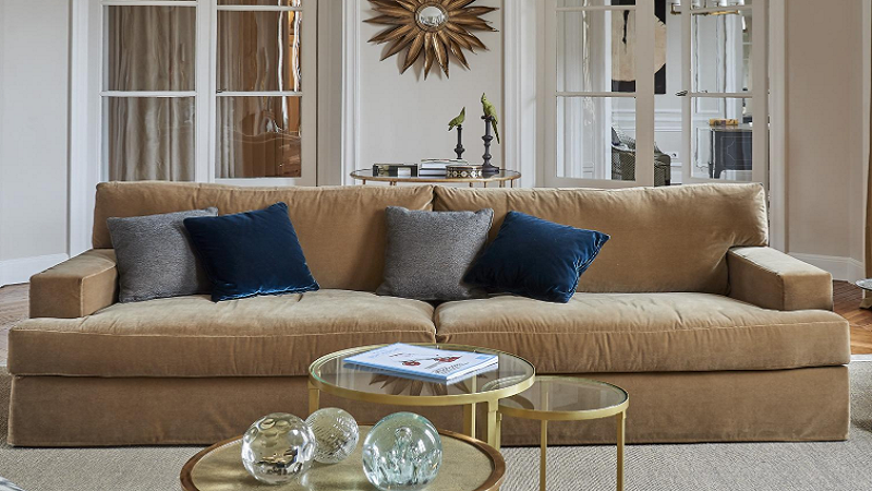
This website can inspire fellow colleagues in this business to experiment on website to offer their visitors more sophisticated experience. Expertise in interior designing, Laure Caye impresses with their breath-taking designed website.
10. Mad Design
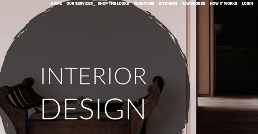
Most people look for appealing website but perfect website is the one which has combination of some cool features and functionality. The homepage of this website is loaded with animation and innovative motion with scrolling. Mad design’s has really worked on how they want the website to appear in front of their visitors.
11. Hart Howerton
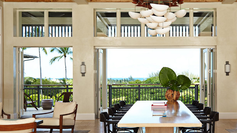
Designed with such creativity, website has been provided a lot of variation with scrolling. Various things appear and disappears when scrolled which gives good feel to the visitors and they take active part in it. The animation has been built beautifully to avoid traditional website feel. Space utilization is one of the things you want to keep in mind for reference.
12. Christopher Stoll
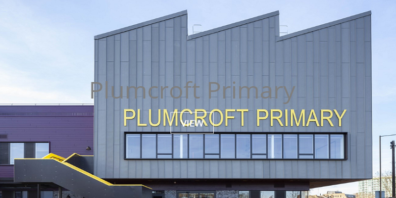
An architect and designer having experience in US and UK, his fascination with urban environment resonates on the website as well. The website shows a lot of slideshows with quality images presenting the work of their craft. Menus have different categories showcasing each project individually. Overall, the website offers a lot more, giving an ultimate experience to the visitor.
13. Jacek Slotala
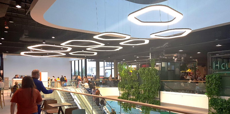
Another unique website which has utilized the space pretty well. They feature side menu, displaying their projects smartly on the home page itself. Also, the website has been built in such a way that the visitor can slide into specific project from their home page itself.
14. Parallel Design Group
The animation and the menu style is one of the eye-catching points on the website. Parallel Design has interactive website design and the motion offered in this website is quite inspirational. Not too many things have been stuffed, rather it has been kept simple to get the most out of it.
15. Verve Interior
Verve’s website has a sleek & straightforward design of homepage. The website uses splendid images of interior designs, innovative display of decoration, and good typography. Has a simple menu and the portfolio page is to the point to impact the user with its simplicity.
16. Studio Lotus
Everything in a box, this website has been intelligently made which rolls out every potential detail you need with just rolling. The boxes have images and text when you hover on them. Showcasing a lot of their projects on the homepage. Studio Lotus used every corner of the website to build an appealing website for its visitors.

