An effective website design is judged by two basic elements- user interface and user experience. Till recently UI designers never got the recognition they deserved, but it’s true without an interactive and engaging UI it is impossible to think of conversions or maximizing reach.
In order to generate call to action through the contents of your website, you will need to strategize and structure your website and related content. What web design principles do you follow to develop the perfect web design that enhances the chances of conversion? There are many factors that affect the experience of your customers. Here are some tips that you may want to consider while designing UI and thus improving the overall experience of your website.
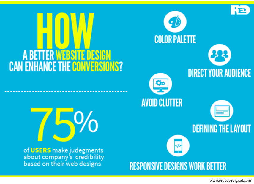
When you are indulging in user interface design color plays an important role. Try having a single color that adds element to the overall design of your website. If you attempt adding too many colors, you may ruin the appeal of the website. When you select colors for your website avoid common indulgences like red, orange and green. For best results, you could also choose to mix colors on the palette to define a shade for your website.
When your target audience visits your website, try to direct them towards call to action that you have successfully incorporated in your website. In order to enhance the appeal of your website, and generate more conversions on the table, you may need to direct your audience towards call to action. Try to please them aesthetically through images, direct content or even arrows where the call to action is located on the website. Use subtle cues to direct the audience.
White space is extremely imperative to a website design. White space should be incorporated in a way that the website stands out in the competition. The best way to integrate white space is to structure the content, make space for the content and avoid clutter. It also enables an easy usability of the website. The user interface with decent amount of white space gives out an amazing user experience. It is not just about the design but also a user friendly form and structure.
A well designed layout of the call for conversation matters a lot. You need to define where you would be place the call to action part along the website. You can either place it along the top of your website, or at the bottom of your website. A strong headline should dominate the call to action course if it is structured along the top of the website. The whole idea of defining this structure is to win the attention and desires of the audiences and finally call in for conversions.
User interface is more enthusiastic and the experience is appealing when the website is responsive in nature. You don’t access the website on laptops only; you tend to use other smart devices as well. You need to make sure that the design is responsive so that more people access the website, the reach is higher and the conversions even higher. With responsive feature added to the websites more people can be reached and higher conversions are enabled due to call to action feature.
Eager to know how a better website design can enhance the conversions ? Contact us Today.


